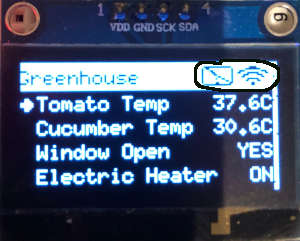
TcMenu supports a wide range of rendering devices, from HD44780 based units using our LiquidCrystal fork through to mono OLEDs and full colour TFT displays using Adafruit_GFX and TFT_eSPI library. Over to the left you see an example of rendering to OLED device with title widgets.
You can also easily take over the display to draw your own screen at any time. This is such a large subject, it deserves a page of its own.
How the menu application looks on the device
How a menu will look on the device will largely depend on which display is used. However, there are a few common features of all displays. They can generally all have a title, and the title can nearly always contain title widgets. Title widgets provide a way to present the graphical state of something within the system in a small icon, the most common would be the signal strength indicator, or a connection status icon. An example showing this is presented below:
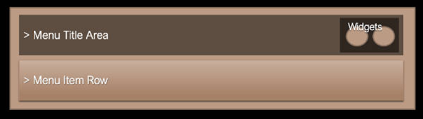
The basic layout of a menu application
Common functions on most renderers
In order to allow for a wide range of displays, we provide multiple extension points within the rendering class hierarchy, and keep as much functionality as possible in the core.
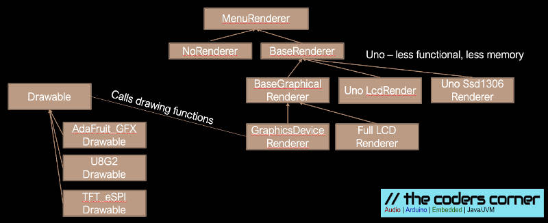
Class Diagram showing nearly all rendering classes
From the above diagram we can see that most graphical and LCD displays (except Uno cases) extend from at least the BaseGraphicalRenderer. And in fact all the true graphical displays extend from GraphicsDeviceRenderer and then have a custom drawable. The benefit of GraphicsDeviceRenderer is that does all the complex logic, and the drawable just has to implement the drawing glue code that calls into the library.
- Type:
BaseMenuRendererin BaseRenderers.h - this just provides a few functions to help formatting items, taking over the display and handling dialogs. - Type:
BaseGraphicalRendererin graphics/BaseGraphicalRenderer.h - extends from above, provides grid based capabilities, but does not do the drawing. - Type:
GraphicsDeviceRendererin graphics/GraphicsDeviceRenderer.h - does all the drawing to an instance ofDrawable - See the reference documentation for base renderer
- See the reference documentation for base graphical renderer
- See the device drawable interface
Renderer integration into the sketch
In all cases the display plugins will create a global variable called renderer in your sketch. It will be at least of type MenuRenderer meaning that you can rely on an absolute base set of functionality. In most cases it will be of BaseGraphicalRenderer or GraphicsDeviceRenderer so you will be able to rely on nearly all functions being available.
Usually, the renderer is initialised during menu setup and this starts a task manager timer task that calls the display back frequently to check if anything needs drawing. It is this task that keeps the screen up-to-date.
Presenting a dialog to the user
- Type:
BaseDialogin BaseDialog.h - for Uno low memory renderers - Type:
MenuBasedDialogin BaseDialog.h - for all other renderers
It is also possible to present a simple dialog for either information, or Yes / No question onto almost all supported displays. Along with this you can optionally decide to let the dialog show on any remote connections, taking over the top of the display similar to an Alert Box.
Before working with dialogs include the header:
#include <BaseDialog.h>
This includes the functions needed to work with dialogs.
Doing something on dialog completion
Firstly, if we are interested in the outcome of the dialog, we must give the dialog a function to call us back upon when complete:
//
// this method is called when the dialog is dismissed.
//
void onDialogFinished(ButtonType btnPressed, void* /*userdata*/) {
    if(btnPressed != BTNTYPE_OK) {
        // do something if OK was pressed.
    }
}
Creating a regular dialog
Next we get hold of the dialog and initialise it. Here we choose a dialog with OK and CANCEL as options:
BaseDialog* dlg = renderer.getDialog();
dlg->setButtons(BTNTYPE_OK, BTNTYPE_CANCEL, 1);
If you are using a menu based dialog (nearly all except Uno renderers), you can get hold of it directly without casting using:
withMenuDialogIfAvailable([](MenuBasedDialog* dlg) {
    // code that relies on the menu based dialog.
}
Now we call the show method to make the dialog take over the screen
// for all cases and versions, you call show providing a character arry in progmem.
dlg->show(pgmHeaderText, remoteAllowed, onDialogFinished); // true = shows on remote sessions.
- pgmHeaderText is the header text for the dialog
- remoteAllowed true if should appear on all remote controls
- onDialogFinished an optional callback when a button is pressed to dismiss the dialog
There are also newer versions of show that have additional features:
// additionally for newer versions you can provide header text that is located in RAM
void showRam(const char* headerRam, bool allowRemote, CompletedHandlerFn completedHandler = NULL);
Lastly we can copy some text into the second line of the dialog (not program memory):
dlg->copyIntoBuffer("Hello");
Showing a dialog as a controller.
Controllers allow you far more control over a dialog, you can not only add additional menu items and buttons to the dialog, but you can also be informed when dialog buttons are pressed before the dialog ends, and be informed when it is initialising.
// and you can even use a controller, to provide additional functionality when buttons are
// pressed or change the text for buttons
void showController(bool allowRemote, BaseDialogController* controller);
Where the BaseDialogController interface is implemented as follows:
class MyController : public BaseDialogController {
public:
    void initialiseAndGetHeader(BaseDialog* dialog, char* buffer, size_t bufferSize) override {
        // Here we should initialise the controller and fill in the buffer provided with the title
    }

    void dialogDismissed(ButtonType buttonType) override {
        // this is called when the dialog is dismissed, the button that was clicked is provided.
    }

    bool dialogButtonPressed(int buttonNum) override {
        // this is called when a dialog button is pressed, returning true will continue default processing,
        // returning false prevents additional default processing
    }

    void copyCustomButtonText(int buttonNumber, char* buffer, size_t bufferSize) override {
        // this will be used to get the text for a button, fill in the buffer with the text.
    }
};
You can add additional menu items of any type to the dialog, you can even add more buttons, additional buttons should be of this type [https://www.thecoderscorner.com/ref-docs/tcmenu/html/class_local_dialog_button_menu_item.html].
void insertMenuItem(MenuItem* item);
Lastly we can copy some text into the second line of the dialog (not program memory):
dlg->copyIntoBuffer("Hello");
Touch screen support
The easiest way to use touch support, is from tcMenuDesigner where it can be automatically added to appropriate display devices, this just explains how designer adds touch support for those who want more information, or wish to do it manually.
Touch screen support is added in two steps, first you must tell the renderer that you’re going to use a touch screen:
void setHasTouchInterface(bool hasTouch);
Then you must create a touch screen manager and encoder, here we show for resistive touch screen but there are many other options:
using namespace iotouch;
ResistiveTouchInterrogator touchInterrogator(xplus, xminus, yplus, yminus);
MenuTouchScreenManager touchScreen(touchInterrogator, renderer, rotation);
Then in your setup method:
touchScreen.start();
menuMgr.initWithoutInput(renderer, &rootMenuItem());
Drawing bitmaps and presenting state with TitleWidget
See the new guide to creating and using TitleWidgets and bitmaps.
Drawing direct to the display with DeviceDrawable
You can draw to any of our displays using the same DeviceDrawable, it is implemented everywhere we have a graphical plugin, the code remains the same in more or less all cases. All the drawing possibilities are documented, read the full device drawable documentation.
However, as a summary, we first get hold of the display drawable and tell the drawable we want to start using it:
auto drawable = renderer.getDeviceDrawable();
drawable->startDraw();
Next set the color that we want to use, there are two choices, set both the draw color and the background, or just change the draw color:
drawable->setColors(RGB(255, 128, 0), RGB(0,0,0));
drawable->setDrawColor(RGB(0,0,255));
We can get the display dimensions as a Coord
Coord size = drawable->getDisplayDimensions();
Now we can go ahead on draw on the device:
drawable->drawBox(Coord(0,0), Coord(320, 20), true);
drawable->drawCircle(Coord(50, 50), 10, true);
For drawing text can get the extents and draw as follows:
// measure the text we are going to put onscreen the coord value
// has the x and y dimensions. Baseline, the baseline offset.
int baseline = 0;
Coord coord = drawable->textExtents(myFont, 0, "Test", &baseline);

// drawing text, simply set the draw color and then text.
drawable->drawText(Coord(0,0), myFont, 0, "Test");
Drawing bitmaps is covered by two cases, with the DrawableIcon bitmap case being more configurable, while there is also support to draw an X-Bitmap (xbm) file too. Paint tool Gimp can create XBMs.
DrawableIcon icon(myIconId, Coord(width, height), DrawableIcon::ICON_XBITMAP, iconData);
drawable->drawBitmap(Coord(0,0), &drawableIcon, selected);

drawable->drawXBitmap(Coord(0,0), Coord(16, 16), xbmpData);
Lastly we stop drawing to ensure the screen is updated call
drawable->endDraw();
A couple of often used types:
Coord(x,y)represents a coordinate in terms of x,y. There is a constructor that takes x and y point pair. It has members x, and y. It can safely be used by value.RGB(r, g, b)represents a color in Red, Green and Blue, each value is between 0..255. Depending on the device driver, this can be assigned tocolor_twhich holds a color object.BLACKandWHITEare nearly always defined.
Buffered rendering to TFT color devices
Some displays are buffered by default, these include nearly all monochrome displays and the LTDC frame buffer support. However, TFT displays are typically not buffered into local memory as the memory requirements would be too high. However, if instead of buffering all 16-bit (or 32-bit) color information, we only buffer a palette then only 2 or 4 bits are needed per pixel. This reduces the memory requirement by about 4-8 times.
Further, we only tend to draw one thing at once, so if we also reduce the height of the buffer, for example, to handle the largest menu item height memory is reduced further. In the case of a 320x40 4 color palette buffer for Adafruit_GFX memory requirement is about 3200 bytes. For TFT_eSPI, the requirement would be about 6400 bytes as the buffers are 4 bit (16 color).
You can check if a device supports sub drawing as follows:
SubDeviceType subType = rootDrawable->getSubDeviceType();
Where the return will be one of NO_SUB_DEVICE, SUB_DEVICE_4BPP, SUB_DEVICE_2BPP, and gives you an idea what type of buffer is available for use. If the sub-device type indicates that a sub device is available, you can then call:
DeviceDrawable* rootDrawable->getSubDeviceFor(Coord(x,y), Coord(w, h), palette, paletteSize);
CAUTION: It will return nullptr if the dimensions are beyond the size that is supported. These dimensions are normally set in the code generator plugin as the line buffer size. If you’re using tcMenu code generator, then the lines to buffer are set up
If you’re using a sub device (IE effectively a memory buffer), and it is palette based, you can map a color_t to a palette index:
color_t getUnderlyingColor(color_t col);
As we said earlier this is not the complete list, see the documentation or one of the examples for a more complete guide:
Other pages within this category
- TcMenu - Overview and quick start
- Multi language locale based menu for Arduino and mbed
- Embedded Java for Raspberry PI and other embedded Linux
- Setting up IO-expanders in the menu designer
- Integrating EEPROM support into menu applications
- Securing sub-menus and remote connections with an Authenticator
- Taking over the display from a renderer
- MenuManager and menu iteration
- Rendering menus to TFT, LCD and OLED using tcMenu
- Menu control using a matrix keyboard
- TcMenu Designer UI - worked example
- Working with Menu Item types in tcMenu
- Working with menu structures using the CLI
- Creating and using Bitmaps and Title Widgets in your menu
- Code Generator and Plugins guide
You'll also find me on: